
Keeping up with the theme of utilizing official government open data to map via an R package I will now turn to the eurostat package which accesses data - via an API - from the European Commission.
First released in 2015, there is an article (wuth R code) by its authors in the most recent issue of the R Journal,9/1 which makes for an interesting read covering a variety of topics
However, by it’s very nature, the article is static and - given the time-lag in publication (around 9 months) - neither uses the most recently available data nor takes advantage of the latest versions of packages or indeed the availability of new ones.
I have, therefore, adapted some of their code. There is quite a lot to take in, so this post just represents the first part of the analysis
As usual, libraries loaded are first
# data
library(eurostat)

# data carpentry
library(tidyverse)
library(stringr)

# interactive plots
library(plotly)

# maps
library(tigris)
library(sf)
library(leaflet)
Mapping Disposable income

An earlier post First look at tidycensus used packages which seamlessly downloaded shapefiles with data in the form of sf list-columns - although for practical purposes I kept geometries seperate and then merged to data, as required
The Eurostat package does not, currently, provide that functionality but a useful tip in the github issues from Joona Lehtomäki resolved this. The shapefile resolution obtained (1:10million) is sufficient for this example wothout looking crude but other levels are available
#Here we a combination of functions from the sf and eurostat packages to get spatial data
res10 <- sf::st_as_sf(eurostat::get_eurostat_geospatial(output_class = "spdf", resolution = 10))

# load table which links regional codes from downloaded data to
# Raw data NUTS_2013 from http://ec.europa.eu/eurostat/ramon/nomenclatures/index.cfm?TargetUrl=LST_CLS_DLD&StrNom=NUTS_2013L&StrLanguageCode=EN&StrLayoutCode=HIERARCHIC

#pre-processing
# areaCodes <- read_csv("data/NUTS_2013.csv")
#
# areaCodes <- areaCodes %>%
#   mutate(name=(str_replace(`NUTS LABEL`,"Arr. ",""))) %>%
#   mutate(name=(str_replace(name,"Prov. ",""))) %>%
#   rename(NUTS_ID=`NUTS CODE`)
#
# write_csv(areaCodes,"data/eurostatAreaCodes.csv")

areaCodes <- read_csv("data/eurostatAreaCodes.csv")

#The datasets now include a common field, NUTS_ID
intersect(names(res10),names(areaCodes))
## [1] "NUTS_ID"
We can view the available tables of content (9333 at time of writing) and then select the code required
toc <- get_eurostat_toc()

toc %>%
                 DT::datatable(width="100%",class='compact stripe hover row-border order-column',rownames=FALSE,options= list(paging = TRUE, searching = TRUE,info=FALSE))
To replicate the original article, enter “disposable income” in the search field. You will see the code used “tgs00026” as one of the options. It provides regional data from 2008-2014, so we can update the original publication from 2011 by several years
data <- get_eurostat("tgs00026", time_format = "raw") #1947x5


# convert time column from Date to numeric, select latest year
df <- data %>%
  mutate(time=eurotime2num(time)) #[1] "unit"    "na_item" "geo"     "time"    "values"

# Label the variables more meaningfully BUT retaion geo code (as geo_code) for joining to shapefile
df_code <- label_eurostat(df, code = "geo")

# select most recent year
df14 <- df_code %>%
filter(time==2014)


# use tigris function to join dataand shapes and just select fields needed for map
euro_geo <- geo_join(res10,df14,  by_sp="NUTS_ID",by_df="geo_code", how = "inner")

glimpse(euro_geo)
## Observations: 275
## Variables: 10
## $ NUTS_ID    <chr> "AT11", "AT12", "AT31", "AT32", "AT33", "AT34", "BE...
## $ STAT_LEVL_ <int> 2, 2, 2, 2, 2, 2, 2, 2, 2, 2, 2, 2, 2, 2, 2, 2, 2, ...
## $ SHAPE_AREA <dbl> 0.47318922, 2.32891627, 1.44857154, 0.85711217, 1.4...
## $ SHAPE_LEN  <dbl> 5.8223295, 9.9171108, 7.9097746, 7.1678345, 9.59231...
## $ unit       <fctr> Purchasing power standard based on final consumpti...
## $ na_item    <fctr> Disposable income, net, Disposable income, net, Di...
## $ geo        <fctr> Burgenland (AT), Niederösterreich, Oberösterreich,...
## $ time       <dbl> 2014, 2014, 2014, 2014, 2014, 2014, 2014, 2014, 201...
## $ values     <dbl> 20800, 21800, 21100, 21500, 20700, 22100, 15800, 18...
## $ geometry   <simple_feature> MULTIPOLYGON (((17.092707 4..., MULTIPOL...
Let’s first look at the distribution - which can be useful in deciding how to set the bins for colour. Alternatively, the eurostat package has a useful cut_to_classes() function which may serve most purposes
df14 %>%
  plot_ly(x=~values)
Actually a pretty Normal distribution - though with one outlier (West Inner London)
Now we can set appropriate breaks and colours. I quite like the original colours but have settled for one which might highlight a sequential nature.
pal <- colorBin(palette = "YlOrRd",
                    domain = euro_geo$values,
                bins=c(0,5000,10000,15000,20000,25000,40000))


# Create pop-up for when state is clicked on display
popups <- str_c(euro_geo$geo,'<br>', format(euro_geo$values, big.mark=",")," Euros per Year")

html_copyright <- "<p>(C) EuroGeographics for the administrative boundaries</p>"


euro_geo %>%
    st_transform(crs = "+init=epsg:4326") %>%
    leaflet(width = "100%") %>%
   setView(lng=9.6,lat=53.6,zoom=3) %>%
      addProviderTiles(provider = "CartoDB.Positron") %>%
    addPolygons(
      popup = popups, #utf issue (so why not before)
                stroke = TRUE, weight=1,
                smoothFactor = 0,
                fillOpacity = 0.3,
                color = ~ pal(values)) %>%
   addControl(html = html_copyright, position = "bottomleft") %>%
    addLegend("bottomleft",
              pal = pal,
              values = ~ values,
              title = "Disposable household<br> income in  2014<br> Euros per annum",
              opacity = 0.3)
The map uses the leaflet htmlwidget, which allows zoom and pan. Click on a region for more data
So we can see a general broad band of highest income running North-South in Germany, Austria and Northern Italy, with lower values as we spread east and west. Capital cities, with part of London being the extreme, tend to higher income but are likely to be associated with greater costs in housing
One variation, would be to see the change in regional data over the time-period of data available
# select extremes of year range, spread data.frame and calc pc change
df0814 <- df_code %>%
  filter(time==2008|time==2014) %>%
  spread(time,values) %>%
  mutate(pc_change=round(100*`2014`/`2008`,1)-100)

df0814 %>%
  plot_ly(x=~pc_change)
euroChange_geo <- geo_join(res10,df0814,  by_sp="NUTS_ID",by_df="geo_code", how = "inner")


pal <- colorBin(palette = "BrBG", # RdYlBu #BrBG
                    domain = euroChange_geo$values,
                bins=c(-40,-20,0,20,40,60,80))

#Tranpose turns a list-of-lists "inside-out"; it turns a pair of lists into a list of pairs


# Create pop-up for when ergion is clicked on display
popups <- str_c(euroChange_geo$geo,'<br>Change:', euroChange_geo$pc_change,"%<br>",
                 format(euroChange_geo$`2014`, big.mark=",")," Euros per Year")


euroChange_geo %>%
    st_transform(crs = "+init=epsg:4326") %>%
    leaflet(width = "100%") %>%
   setView(lng=9.6,lat=53.6,zoom=3) %>%
      addProviderTiles(provider = "CartoDB.Positron") %>%
    addPolygons(
      popup = popups, #utf issue (in initial download)
                stroke = TRUE, weight=1,
                smoothFactor = 0,
                fillOpacity = 0.3,
                color = ~ pal(pc_change)) %>%
  addControl(html = html_copyright, position = "bottomleft") %>%
    addLegend("bottomleft",
              pal = pal,
              values = ~ pc_change,
              title = "% Change in Disposable <br> Household Income <br> 2008-2014",
              opacity = 0.3)
This covers the period of the financial crisis, which started in 2008. As can be seen, East Europeans have benfited most over the seven year period, albeit from a low base and Greece, in particular, has suffered
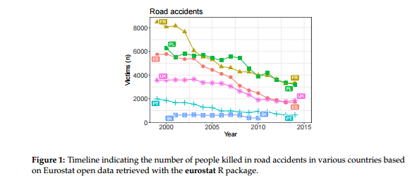
Road Accidents
This example indicates the number of people killed in road accidents, by year, by country
t1 <- get_eurostat("tsdtr420")
pop <- get_eurostat("nama_10r_3popgdp")

#this is a useful function providing more meaningful labels to columns but having issues with
# this dataset
#t1 <- label_eurostat(t1)
#pop <- label_eurostat(pop, code="geo")


 lp <- get_eurostat("nama_aux_lp")
   lpl <- label_eurostat(lp)
   str(lpl)
## Classes 'tbl_df', 'tbl' and 'data.frame':    8289 obs. of  5 variables:
##  $ indic_na: Factor w/ 3 levels "Labour productivity",..: 1 1 1 1 1 1 1 1 1 1 ...
##  $ unit    : Factor w/ 9 levels "Percentage of EU27 total (based on PPS per employed person)",..: 1 1 1 1 1 1 1 1 1 1 ...
##  $ geo     : Factor w/ 45 levels "Austria","Belgium",..: 1 2 3 4 5 6 7 8 9 10 ...
##  $ time    : Date, format: "2013-01-01" "2013-01-01" ...
##  $ values  : num  113.4 127.3 43.4 114.9 91.8 ...
   lpl_order <- label_eurostat(lp, eu_order = TRUE)
   lpl_code <- label_eurostat(lp, code = "unit")
   label_eurostat_vars(names(lp))
## [1] "National accounts indicator"
## [2] "Unit of measure"
## [3] "Geopolitical entity (reporting)"
## [4] "Period of time (a=annual, q=quarterly, m=monthly, d=daily, c=cumulated from January)"
   label_eurostat_tables("nama_aux_lp")
## [1] "Labour productivity - annual data"


t1 <- t1 %>%
  select(geo,time,values)

#limit pop values to country only. Need to change from factor
country_pop <- pop %>%
  filter(nchar(as.character(geo))==2)  %>%
  rename(pop=values)

# get rate per 100,000
df <- t1 %>%
  left_join(country_pop) %>%
  filter(!is.na(pop)) %>%
  mutate(rate=100*values/pop,year=str_sub(time,1,4))


# Selection of countries from R Journal example
countries <- c("UK", "SK", "FR", "PL", "ES", "PT")

df %>%
  group_by(geo) %>%
  filter(geo%in% countries) %>%
  plot_ly(x=~year,y=~rate,color=~geo) %>%
  add_lines() %>%
  layout(title="Rate of Road Accidents in selected EU countries<br> 2000-2015",
         xaxis=list(title=""),
         yaxis=list(title="Rate per 100,000")
         ) %>%  config(displayModeBar = F,showLink = F)
This is an area where there has been pretty steady improvement over many years (e.g UK highest absolute level was in 1966) as cars have better safety features, roads are improved and restriction on drink/drug consumption and invocation of seat-belt usage has been enforced. No country covered by Eurostat now has a death rate in excess of 10 per 100,000 population
I have restricted the countries to those selected for R Journal article. Showing all at once would be a bit confusing though plotly offers the option to toggle lines on or off by clicking on the legend. Just remove the filter(geo %in% countries) %>% line to take effect.
Additionally, a map may be of interest
# Latest data - a couple of countries have no data
df15 <- df %>%
  filter(year=="2015")

accidents_geo <- geo_join(res10,df15,  by_sp="NUTS_ID", by_df="geo", how = "inner")


pal <- colorBin(palette = "YlOrRd",
                    domain = accidents_geo$rate,
                bins=c(0,2,4,6,8,10))


#popups <- str_c(accidents_geo$geo,"<br>Rate: ",round(accidents_geo$rate,1)," per 100,000")
popups <- str_c(accidents_geo$NUTS_ID,"<br>Rate: ",round(accidents_geo$rate,1)," per 100,000")


accidents_geo %>%
    st_transform(crs = "+init=epsg:4326") %>%
    leaflet(width = "100%") %>%
   setView(lng=9.6,lat=53.6,zoom=3) %>%
      addProviderTiles(provider = "CartoDB.Positron") %>%
    addPolygons(
      popup = popups,
                stroke = TRUE, weight=1,
                smoothFactor = 0,
                fillOpacity = 0.3,
                color = ~ pal(rate)) %>%
  addControl(html = html_copyright, position = "bottomleft") %>%
    addLegend("bottomleft",
              pal = pal,
              values = ~ rate,
              title = "Road Accidents 2015<br>Deaths per 100,000 popn",
              opacity = 0.3)
Although rates have come down there is quite the disparity by countries. A lot more data on population density and distance travelled by vehicles by country would be needed to be built into any model, but one interesting point is that Belgium’s rate is roughly three times that of its neighbour, the Netherlands
This seems enough for now, but the RJournal coverage includes a few extra examples which I hope to return to before too long
@article{RJ-2017-019, author = {Leo Lahti and Janne Huovari and Markus Kainu and Przemysław Biecek}, title = {{Retrieval and Analysis of Eurostat Open Data with the eurostat Package}}, year = {2017}, journal = {{The R Journal}}, url = {https://journal.r-project.org/archive/2017/RJ-2017-019/index.html}, pages = {385–392}, volume = {9}, number = {1} }