Of course, it is not the same as actually being there, but as a good fall-back the videos of the talks for the R User 2017 conference are now available on channel 9.
I’ll be dipping into them over the next few weeks and reporting on any I find of interest.
Let’s kick-off with the padr package from Edwin Thoen. It is on CRAN
padr is an R package that assists with preparing time series data. It provides two main functions that will quickly get the data in the format you want. When data is observed on too low a level, thicken will add a column of a higher interval to the data frame, after which the user can apply the appropriate aggregation. When there are missing records for time points where observations were absent, pad will automatically insert these records. A number of fill_ functions help to subsequently fill the missing values.
Load libraries
library(tidyverse)
library(vembedr)

library(plotly)

library(padr)
Here is his lightning talk
embed_user2017("Room-301-Lightning-Talks", width = 560, height = 315, frameborder = 0,
  allowfullscreen = TRUE) %>%
  use_start_time("5m20s")
My example uses a small dataset of the season debut of players for clubs in the English Premier League over the past two campaigns
df <- read_csv("data/soccer/seasonDebut.csv")
head(df)
## # A tibble: 6 x 2
##            name   gameDate
##           <chr>     <date>
## 1          Eder 2015-08-08
## 2       Memphis 2015-08-08
## 3         Oscar 2015-08-08
## 4       Willian 2015-08-08
## 5  Adam Johnson 2015-08-08
## 6 Adam Matthews 2015-08-08
The raw data shows dates for a given day and I want to produce a plot - a line chart like Edwin’s example - but collating the data on a less granular basis.
Let’s first look at the data applying the thicken() function which places the data into a higher interval. The full range available is year, quarter, month, week, day, hour, minute, or second. in this instance, ‘month’ seeems the most appropriate
As there is only one date-time field, it does not need to be specified
df_month <- df %>%
    thicken('month') %>%
    group_by(gameDate_month) %>%
    summarise(month_count = n())

df_month %>%
                         DT::datatable(class='compact stripe hover row-border order-column',rownames=FALSE,options= list(paging = TRUE, searching = FALSE,info=FALSE))
df_month %>%
ggplot(aes(gameDate_month, month_count)) + geom_line() 
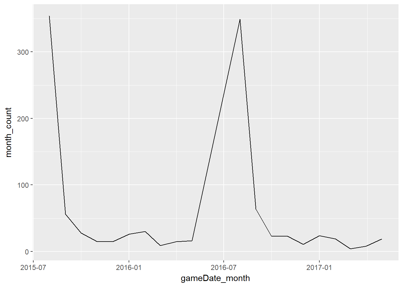
Not unexpectedly, most of the season debuts are in the first few weeks of each year i.e. in August. However, you can see a problem here in that the chart spans an - off-season of June and July 2016 - which the line chart does not cater for
Enter the pad() function. The default values are again appropriate
df_month <- df %>%
    thicken('month') %>%
    group_by(gameDate_month) %>%
    summarise(month_count = n()) %>%
    pad()


df_month %>%
                         DT::datatable(class='compact stripe hover row-border order-column',rownames=FALSE,options= list(paging = TRUE, searching = FALSE,info=FALSE))
df_month %>%
ggplot(aes(gameDate_month, month_count)) + geom_line() 
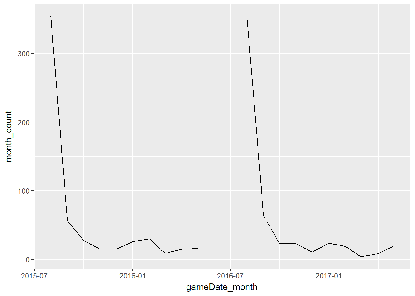
The missing months are now included (with NA values) and the chart now reflects reality
In this example, a barchart would probably be more appropriate - and would not have necessitated the pad() code.
Here is a plotly version
df_month %>%
  plot_ly(x=~gameDate_month, y=~month_count) %>%
  add_bars() %>%
  layout(title="Monthly season debuts of EPL players",
         xaxis=list(title=""),
         yaxis=list(title="Count")) %>%
   config(displayModeBar = F,showLink = F)
More than 70% of players make their debuts in August. There are slight tick-ups in January and February - in line with new players acquired in the transfer window - and at the end of season, when youngsters are often introduced in relatively meaningless games
So, all-in-all a simple but useful addition to the R toolkit