My last post was a first look at StatCan data which highlighted that there was a lot of data available but that it was not necessarily easily available or perfectly presented
Since then (and apologies where due), I have come across a couple of APIs
First-off, StatCan do have a developers page one of which provides access to hundreds of indicators in JSON format. Here is an example of one they have tweeted
library(blogdown)
shortcode("tweet", "894317284046630912")
In May 2017, Canada imported $7,362,018 worth of oral or dental hygiene preparations, nes. #FreshBreathDay pic.twitter.com/qoArG3QX57
— Statistics Canada (@StatCan_eng) August 6, 2017
Let’s load the libraries and see what is available for the all indicators option
library(httr)
library(jsonlite)
library(listviewer)
library(tidyverse)


library(stringr)
library(plotly)
The listviewer package, an htmlwidget from the ubiquitous Kent Russell and others, provides a great way to explore lists
url <- "http://www.statcan.gc.ca/sites/json/ind-all.json"
response <- GET(url)
parsed <- fromJSON(content(response, "text"), simplifyVector = FALSE)
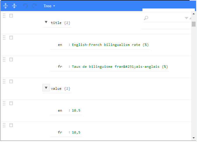
jsonedit(parsed)If you drill down “results > indicators > 0 > title > en” you can see the title of one of the more than thousand indicators. I believe they get added consecutively to the top but at the time of writing the first one was
“Proportion (%) of one-person houselds” with a value of 28.2%.
This is from the 2016 census and the first occasion on which this category has exceeded ‘couple’s with children’ as the most common household configuration
OK, let’s see what we can output from this list. In purrr there is usually more than on way to skin a cat (groan). Any suggestions for improvement welcome
# start deeper into the nested list
ind_list <- parsed$results$indicators

# Now use purrr to create atomic vectors

registry_number <- map_chr(ind_list, "registry_number")
indicator_number <- map_chr(ind_list, "indicator_number")
geo_code <- map_chr(ind_list, "geo_code")
source <- map_chr(ind_list, "source")
themes <- map_chr(ind_list, "themes")
release_date <- map_chr(ind_list, "release_date")

## For those where we need to go down a further level we can use a vector
## either numbered
title <- map_chr(ind_list, c(4, 1))
#or text
refper <- map_chr(ind_list, c("refper", "en"))
value <- map_chr(ind_list, c("value", "en"))
daily_url <- map_chr(ind_list, c("daily_url", "en"))
daily_title <- map_chr(ind_list, c("daily_title", "en"))

## combine into a data.frame
l <-
  list(
    registry_number = registry_number,
    indicator_number = indicator_number,
    geo_code = geo_code,
    source = source,
    themes = themes,
    release_date = release_date,
    title = title ,
    refper = refper,
    value = value,
    daily_url = daily_url,
    daily_title = daily_title
  )

indices.df <- as_tibble(l)

#and display in a table with selected columns
indices.df %>%
  select(geo_code,source,themes,title,value) %>%
  DT::datatable(width=600,
    class = 'compact stripe hover row-border order-column',
    rownames = FALSE,
    options = list(
      paging = TRUE,
      searching = TRUE,
      info = FALSE
    )
  )
NB I have shown only a selection of columns to cater for narrow blog width
You can search for an item of interest e.g try “Potato” and you can see that there is one entry which appears to show 344,884 acres of Potatoes were planted in Canada this year, more than enough to cover Phoenix’s city limits
Looking back at the listviewer we can see that two of the table columns geo_code and themes appear to have equivalent raw data. Let’s tabulize them as well. It’s easier the second time through. For any Francophiles, just swap in the French alternative
geo_list <- parsed$results$geo

geo_code <- map_chr(geo_list, "geo_code")
geo_name <- map_chr(geo_list, c(2,1))


l <-
  list(
    geo_code=geo_code,
    geo_name=geo_name
    )

geo.df <- as_tibble(l)

geo.df %>%
  DT::datatable(
    class = 'compact stripe hover row-border order-column',
    rownames = FALSE,
    options = list(
      paging = TRUE,
      searching = TRUE,
      info = FALSE
    )
  )
## similar for themes - probably a map_df alternative

theme_list <- parsed$results$themes_en


theme_code <- map_chr(theme_list, 1)
theme_name <- map_chr(theme_list, 2)


l <-
  list(
   theme_code=theme_code,
    theme_name=theme_name
    )

theme.df <- as_tibble(l)

theme.df %>%
  DT::datatable(
    class = 'compact stripe hover row-border order-column',
    rownames = FALSE,
    options = list(
      paging = TRUE,
      searching = TRUE,
      info = FALSE
    )
  )
OK we can now link the geo data.frames to make the tabe more meaningful
indices.df %>%
  left_join(geo.df) %>%
  select(title,refper,geo_name,themes,value,source)%>%
                         DT::datatable(class='compact stripe hover row-border order-column',rownames=FALSE,options= list(paging = TRUE, searching = TRUE,info=FALSE))
Type in ‘one-person’ and you will see that the Proportion of one-person households ranges by province from 18.9% in Nunavut to 33.3% in Quebec
Now lets search for indicators relating to the theme of ‘Agriculture’ which has a code of 920. Enter 920 in the search and you can find out if vegetables are worth more to the Canadian economy than fruits
Note the final column, source. If you enter the fruits value ‘10009’ into the CANSIM search field you will get forwarded to a table from which the underlying indicator has been extracted
NB This search/browse page(http://www5.statcan.gc.ca/cansim/a01?lang=eng) also has links to all tables, not just those for which there are indicators. These would need to be scraped, currently

This is a subset of a data table with provincial breakdowns over a greater time period
The CANSIM process is that you manipulate on-line the data you want and then you can download a csv. So, if, for example, all you were interested in was tonnage of pears from PEI for the years 2001-2006 (answer not much) this might be the best way to proceed
However, often it is better just to download all potentially-relevant data and then do some exploratory analyses within R. This is feasible but still needs a few clicks and moving the downloaded file to the appropriate folder and then importing it into R. I know, I want the easy life
Enter CANSIM2R an R package which ‘Directly Extracts Complete CANSIM Data Tables’. This was developed a couple of years ago by Marco Lugo when he was at the University of Montreal and has a couple of functions - one of which, getCANSIM(), extracts a complete CANSIM (Statistics Canada) data table and converts it into a readily usable panel (wide) format.
I did not find this a particulaly useful end-product (try the vignette for an example) but the behind-the-scenes code was valuable. It was PT (Pre-Tidyverse) but works just fine. For some reason the fruit table code did not work so I substituted ….
Funding of Research and development expenditures in the higher education sector
library(Hmisc)
library(utils)
createStatCanVariables <- function(df){
  VectorPosition <- match("Vector",names(df))

  #Only create new variable if there is more than one column from StatCan
  if(VectorPosition > 4) df$StatCanVariable <- apply(df[,c(3:(VectorPosition-1))], 1, function(x) paste(x, collapse = "; "))
  else df$StatCanVariable <- df[,3]

  return(df)
}

downloadCANSIM <- function(cansimTableNumber){
  temp <- tempfile()
  url <- "http://www20.statcan.gc.ca/tables-tableaux/cansim/csv/"
  filename <- paste0("0", cansimTableNumber, "-eng")

  url <- paste0(url, filename, ".zip")
  download.file(url, temp, quiet = TRUE)
  data <- read.csv(unz(temp, paste0(filename, ".csv") ), stringsAsFactors = FALSE)
  unlink(temp)

  data <- createStatCanVariables(data)

  data$Vector <- NULL
  data$Coordinate <- NULL
  suppressWarnings(data$Value <- as.numeric(data$Value))

  return(data)
}

#df_raw <- downloadCANSIM(00010009)
df_raw <- downloadCANSIM(3580162)


df_raw %>%
    DT::datatable(class='compact stripe hover row-border order-column',rownames=FALSE,options= list(paging = TRUE, searching = TRUE,info=FALSE))
So we have 6930 rows with quite a few varaitions by variable e.g. several provinces in addition to all Canada. Let’s look at what is in the table in a more programmatic manner
cols <- 1:5
lapply(cols, function(i) setdiff(df_raw[,i], unlist(df_raw[-i])))
## [[1]]
##  [1] "2000/2000" "2001/2001" "2002/2002" "2003/2003" "2004/2004"
##  [6] "2005/2005" "2006/2006" "2007/2007" "2008/2008" "2009/2009"
## [11] "2010/2010" "2011/2012" "2012/2013" "2013/2014" "2014/2015"
##
## [[2]]
##  [1] "Canada"                    "Newfoundland and Labrador"
##  [3] "Prince Edward Island"      "Nova Scotia"
##  [5] "New Brunswick"             "Quebec"
##  [7] "Ontario"                   "Manitoba"
##  [9] "Saskatchewan"              "Alberta"
## [11] "British Columbia"
##
## [[3]]
## [1] "Total funding sectors" "Federal government"    "Provincial government"
## [4] "Business enterprise"   "Higher education"      "Private non-profit"
## [7] "Foreign"
##
## [[4]]
## [1] "Total sciences"                   "Natural sciences and engineering"
## [3] "Social sciences and humanities"
##
## [[5]]
## [1] "Current prices (x 1,000,000)"
## [2] "2007 constant prices (x 1,000,000)"
So from 2000 to 2014 (though the end month may have changed part way through); all major provinces; six funding methods; and two types each of science and price categorization
Let’s start off with a simple line-graph of total science funding over-time, by province - setting an index=100 in 2000
# add a year column and restrict the data as required, resulting in 165 observations
df <-df_raw %>%
  mutate(year=str_sub(Ref_Date,1,4)) %>%
  filter(SECTOR=="Total funding sectors"&SCIENCE=="Total sciences"&PRICE=="2007 constant prices (x 1,000,000)")

# create an index of change at constant prices and plot
df %>%
  group_by(GEO) %>%
    slice(1) %>%
  select(GEO,base=Value) %>%
  right_join(df) %>%
  mutate(index=round(100*Value/base,1)) %>%
  plot_ly(x=~year,y=~index,color=~GEO) %>%
    add_lines()
So, in general an upward trend - though at a lesser rate more recently. Saskatchewan seems to have been more hard done by this century as a whole - though a per population figure might be more appropriate
With such a wide range in absolute funding by province, reflecting the population disparities, let’s have a look at a couple of stacked bar charts at how funding over the 2012-2014 period has been made
df <- df_raw %>%
  mutate(year=as.integer(str_sub(Ref_Date,1,4))) %>%
  # eliminate the totalled values
  filter(year>2011& GEO!="Canada"&SCIENCE=="Total sciences"
         &SECTOR!="Total funding sectors"&PRICE=="2007 constant prices (x 1,000,000)") %>%
  select(year,SECTOR,GEO,Value) %>%
  group_by(SECTOR,GEO) %>%
  summarise(Funding=sum(Value))

df %>%
  group_by(GEO) %>%
  mutate(pc=round(100*Funding/sum(Funding),1)) %>%
  plot_ly(x=~GEO,y=~pc,color=~SECTOR) %>%
  add_bars() %>%
  layout(barmode = "stack",
         margin=list(b=100),
         title="Proportion of Science Funding, by Method, by Province",
         xaxis=list(title=""),
         yaxis=list(title="Percent Breakdown")
                 ) %>%  config(displayModeBar = F,showLink = F)
df %>%
  group_by(SECTOR) %>%
  mutate(pc=round(100*Funding/sum(Funding),1)) %>%
  plot_ly(x=~SECTOR,y=~pc,color=~GEO) %>%
  add_bars() %>%
  layout(barmode = "stack",
         margin=list(b=100),
         title="Proportion of Science Funding,  by Province, by Method,",
         xaxis=list(title=""),
         yaxis=list(title="Percent Breakdown")
                 ) %>%  config(displayModeBar = F,showLink = F)
So, as hoped for, even in a randomly selected area some food for thought arising out of exploratory analysis
That seems quite enough for now but I hope to return to this again in the future